- UI/UX
- Web Design
- Visual Design
- UX Research
- Responsive Design
- Interaction Design
- Prototyping
- Usability Testing
- Brand Development (including naming the brand)
- Logo Design
- Shaping the Overall Aesthetic for both the website and physical store
UX/UI Design:
- Competitive analysis
- User surveys and one-on-one interviews
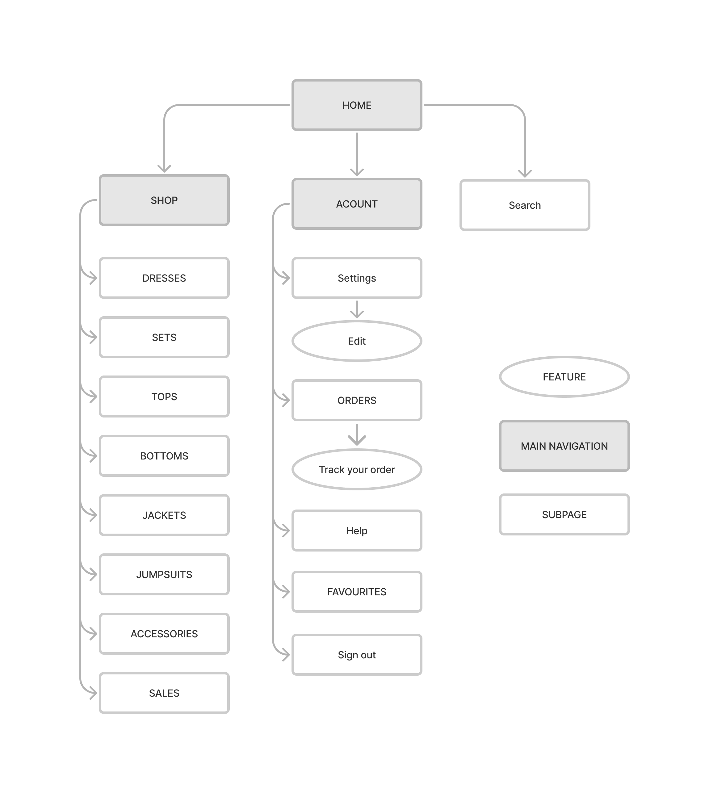
- Site map
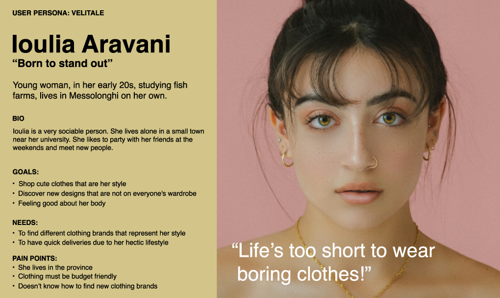
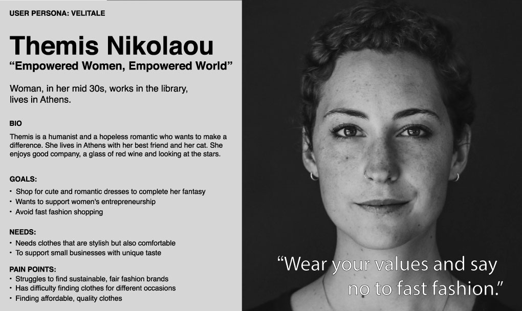
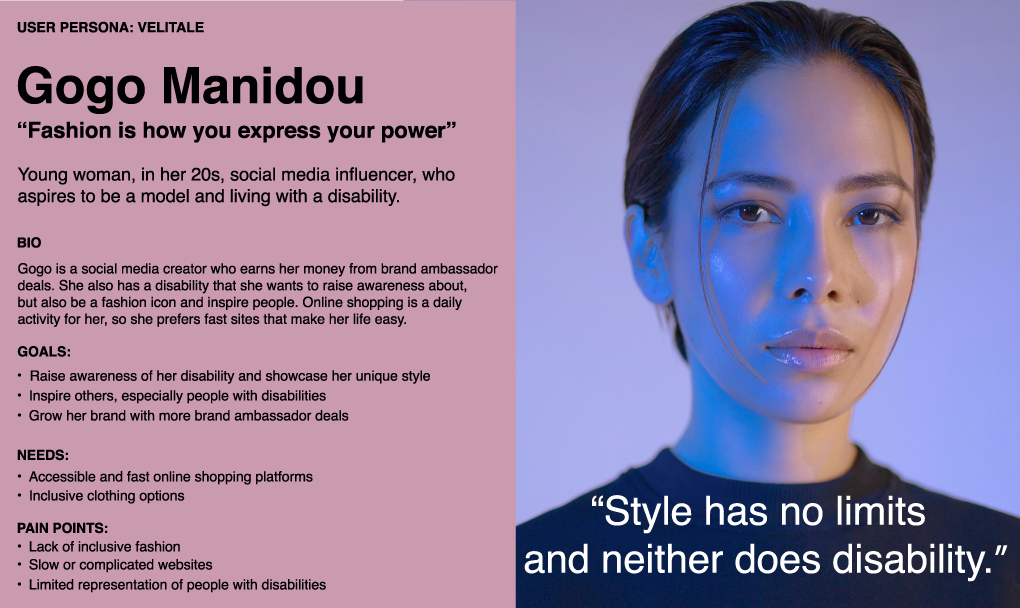
- Personas
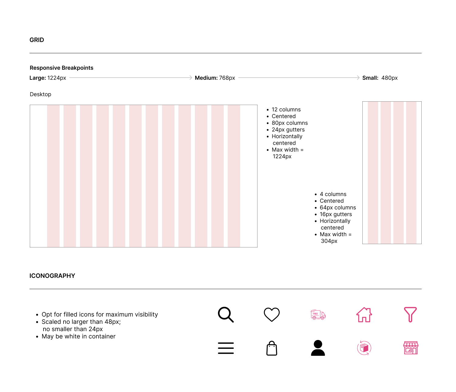
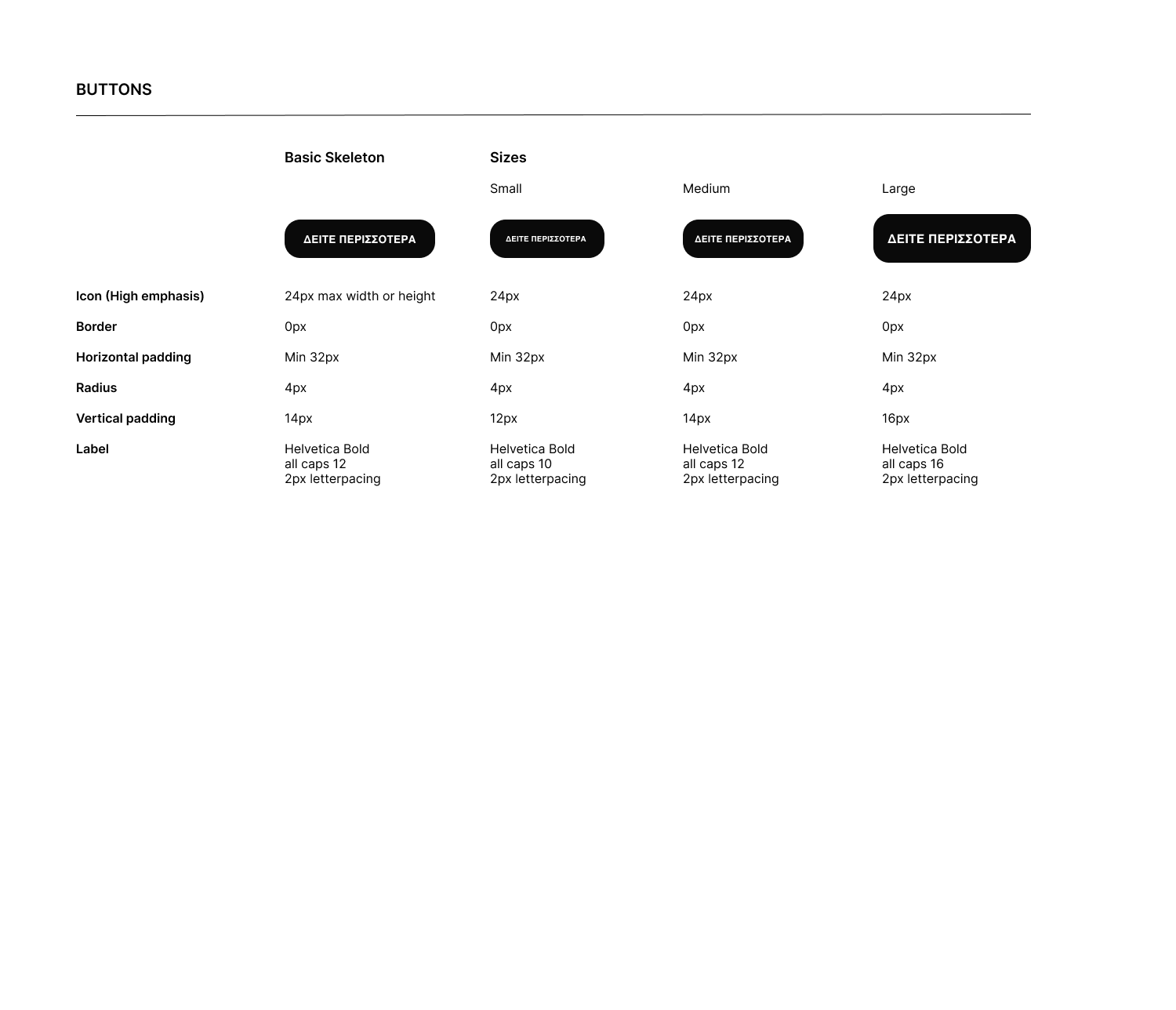
- UI kit
- 3 designs options presented
- High-fidelity mockups & prototypes
- Usability tests and findings
Tools:
- Figma
- Photoshop
- Illustrator
- HTML
- CSS
User Research &
Define Problems
Competitive
Analysis
Define features
Design &
Prototype
Development
User Testing
Problems
There are countless online and physical stores offering women's clothing, making it difficult to stand out in a crowded marketplace.
Some users are increasingly hesitant to engage with fast fashion due to its environmental impact and ethical concerns.
Many users with disabilities feel underserved by traditional fashion brands and seek more inclusive options.
Proposed Solutions
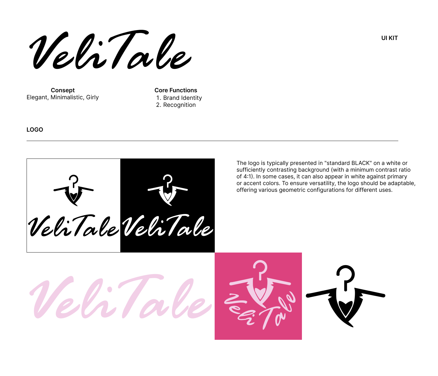
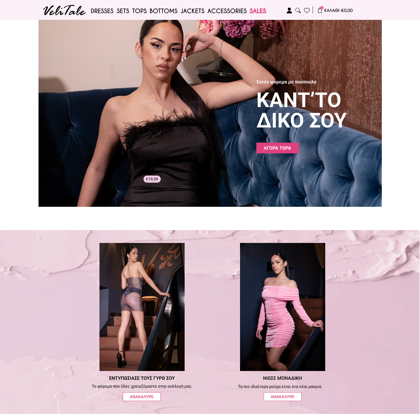
Create a unique and cohesive brand identity that emphasises both modern femininity and fresh aesthetics. This was to be achieved through a visually distinctive design language, bespoke imagery and a refined shopping experience.
Promote sustainable fashion practices and educate customers about sustainability.
Design a website and products with accessibility and inclusivity in mind, including screen reader compatibility and adjustable sizing.
Research
I started with a competitive analysis to identify gaps in the womenswear market and opportunities for differentiation. I gathered insights from customer feedback through surveys and interviews to better understand user preferences. To gauge attitudes towards fast fashion and sustainability, I conducted user surveys, which revealed significant concerns about ethical practices in the industry. I also conducted one-to-one interviews with users with disabilities to explore their specific needs and preferences. Finally, I reviewed accessibility guidelines and web design best practice to ensure an inclusive and user-friendly experience.
Findings
1. Consumers want brands that stand out through storytelling and authenticity.
2. A focus on sustainable practices and unique designs can differentiate the brand.
3. Many consumers choose apparel brands based on sustainability and ethics.
4. Consumers engage with brands that align with their values.
5. Users value brands that promote inclusivity and accessibility.
6. Accessible design broadens the customer base.
Customers valued a unique, cohesive brand paired with a clean, minimalist design
Developing Empathy with the users
Through extensive research and testing, we developed a deep understanding of our users' needs and preferences. It became clear that people are looking for more than just an online shopping platform; they want a visually cohesive, intuitive and trusted experience that matches their personal style and provides a seamless journey from discovery to purchase.
- Users want a distinctive, stylish brand that stands out
- A simple, intuitive design is essential for a smooth shopping experience
- Clear policies, descriptions and reviews build trust in online shopping
- Users want quality images, views and info for confident purchases
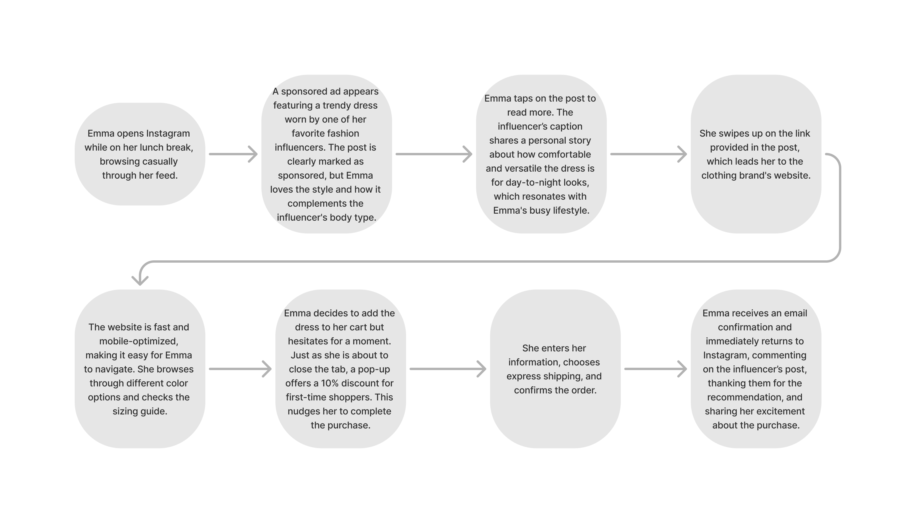
User Case Scenario
I created a user case scenario of someone engaging with an ad on social media to help me
prioritise the features and functionality that should be included in the design.
This helped me focus on design elements based on how users interact with the product in reality.
Example: Social Media Scroll to Purchase. User: Emma, a 28-year-old
professional, regularly scrolls
through social media during her commute. She loves following fashion influencers and discovering
new
trends.
Information Architecture
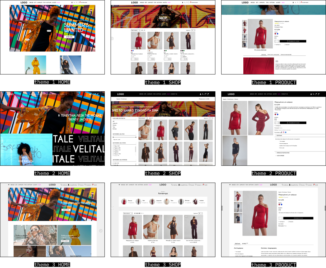
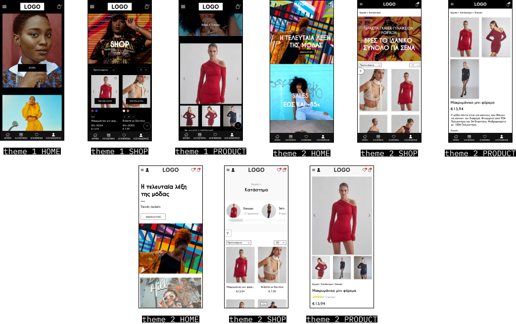
Theme selection
Due to time constraints, I did not conduct rapid sketching or low-fidelity wireframes. Instead, I
designed three different theme options that illustrated the overall
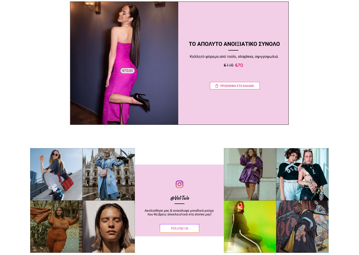
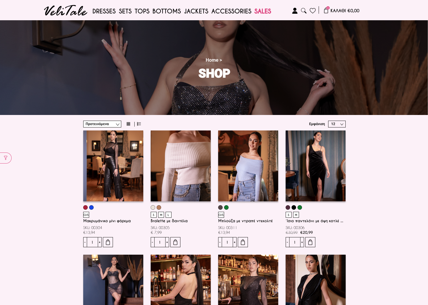
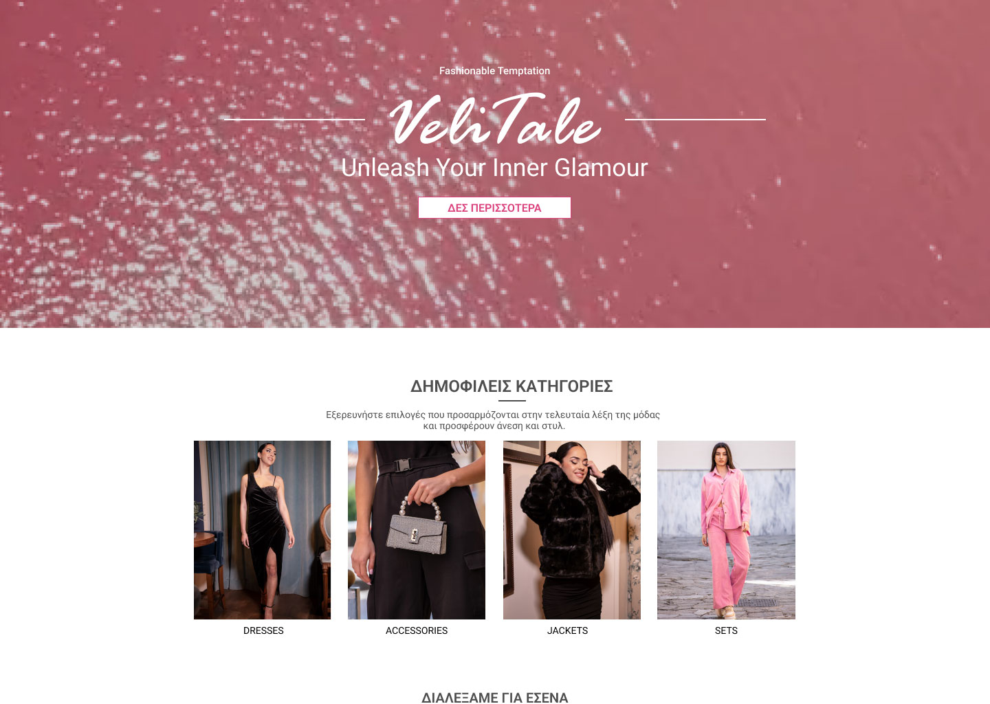
layout of the site. With this foundation in place, we focused primarily on the home page and product
layout, ensuring that the information for each product was minimal
and clear to facilitate a smooth user experience. Once these elements were in place, I turned my
attention to the finer details, such as the overall aesthetic.
Launch
Theme 1 on DESKTOP
on
Phone
Launch
Theme 2 on DESKTOP
on
Phone
Launch
Theme 3 on DESKTOP
on
Phone

DESKTOP


PHONE

Clarifying Visual Design
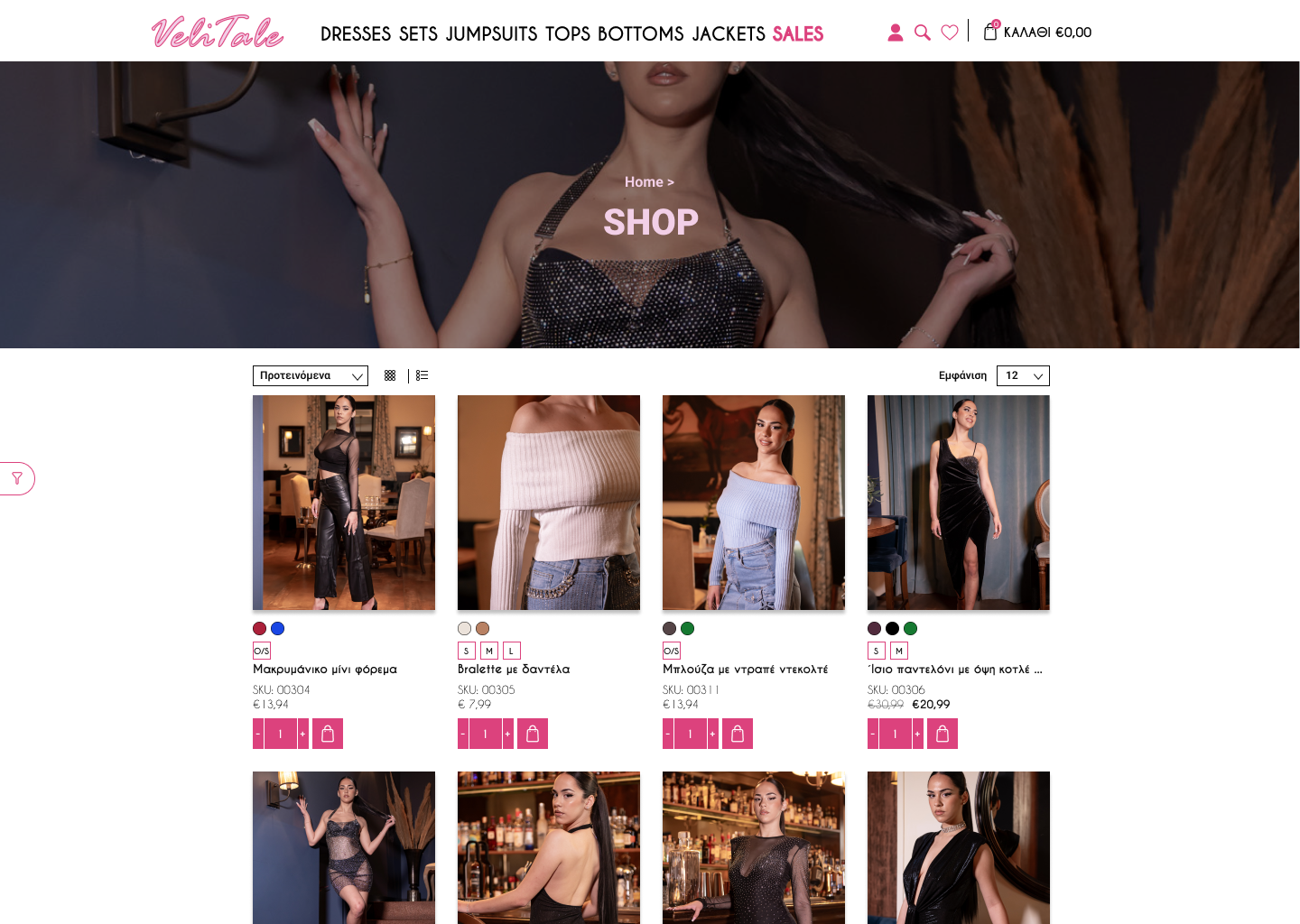
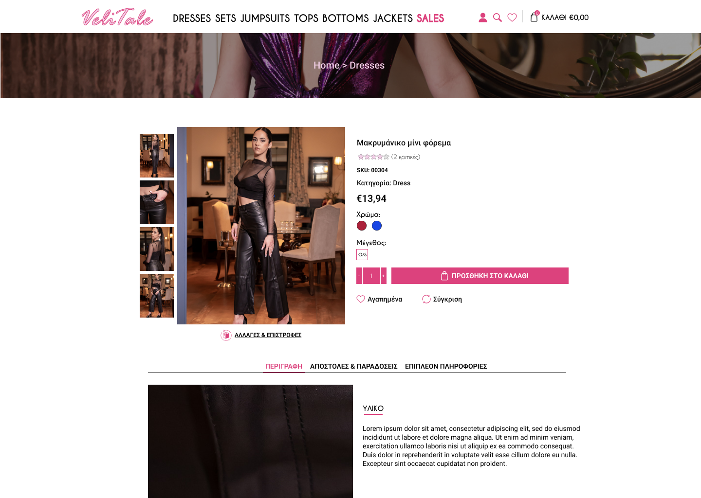
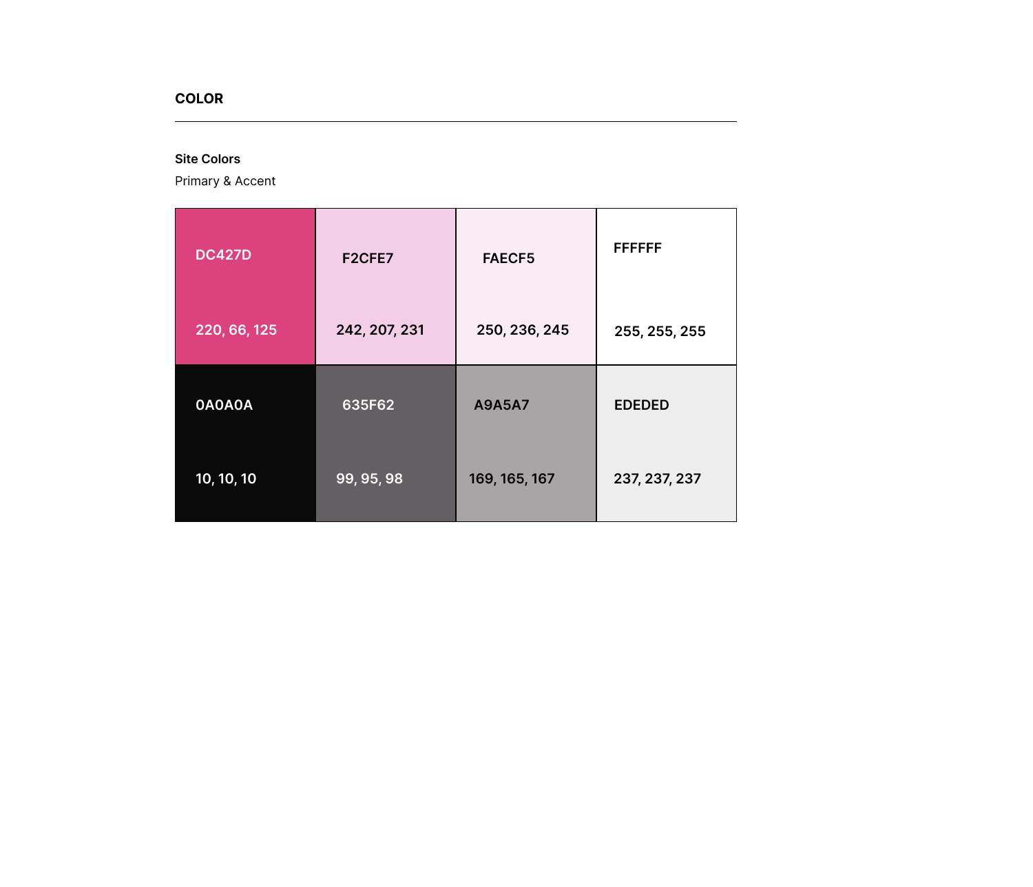
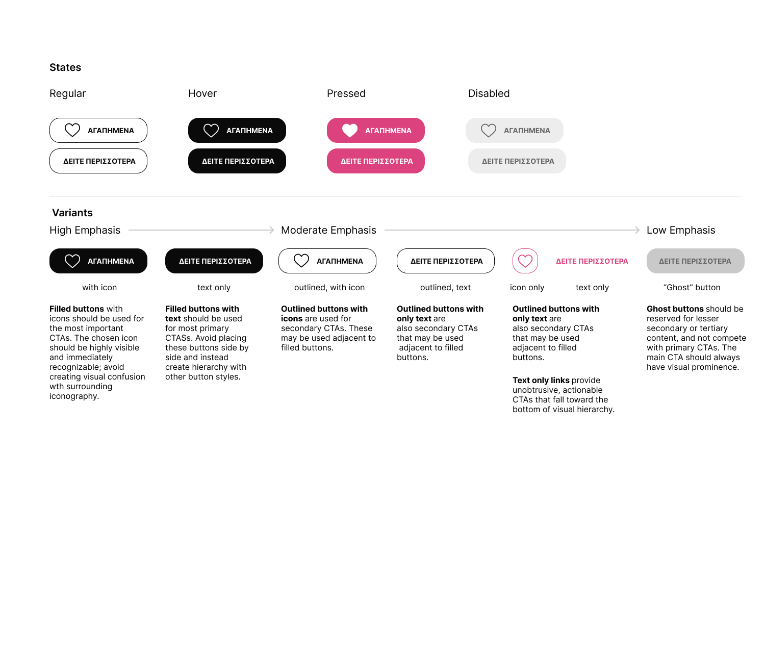
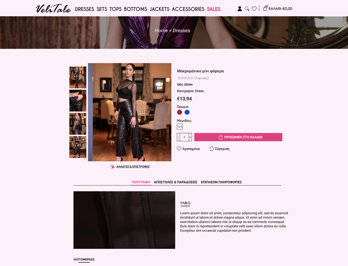
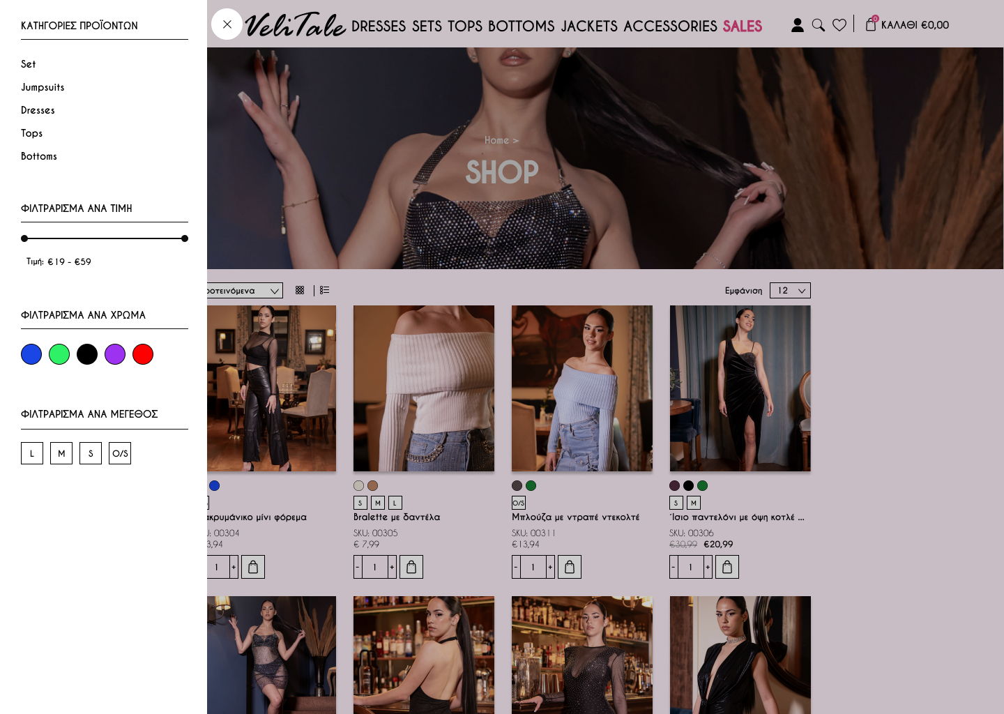
We experimented with bold colours for the buttons to reinforce the girly image. We realised the intense colours were overwhelming, so we switched to a more muted black for the primary buttons and used the vibrant colours strategically. The 'Add to Cart' button was designed in an intense colour to catch the customer's eye and provide a clear path to checkout. This approach enhanced the overall aesthetic and improved the usability of the site.
High Fidelity Prototype
The hi-fi wireframes were detailed and interactive, showing the layout and functionality of each
component. They demonstrated the flow of user interactions and allowed for user testing and iterative
feedback, ensuring a smooth, intuitive experience before final development.
Launch
Prototype in PC mode
or in phone mode.
Usability Testing
I used a combination of screen recording and think-aloud protocols, in which participants voiced
their thoughts as they navigated the site.
This helped to reveal not only how they interacted with the interface, but also how they perceived
it. Testing was conducted on both desktop
and mobile devices to ensure a consistent experience across platforms.
Results:
- Product filtering: While users generally found the filters helpful, two participants struggled with the categorisation of products and suggested that clearer labels or a more intuitive filter structure would improve navigation.
- Add to cart button visibility: The vibrant 'Add to Cart' button drove users to checkout, proving our design choice supported the goal of simplifying purchases.
- Checkout flow: Three out of five participants found the checkout process seamless, but two indicated that the lack of guest checkout was a pain point, causing them to hesitate at the account creation step. As a result, we prioritised adding a guest checkout option to the final product.
Summary
I designed a women's clothing website with a fresh look and seamless user experience. I designed the user interface, created a responsive design and tested it. The challenge was to create a unique online presence that would stand out and meet diverse users' needs. I created three theme options showcasing the site's layout. The home page and product layout are simple and clear for easy shopping. Research showed that customers want fast browsing and a simple checkout. We tested bold colours but opted for a more sophisticated approach, using black for primary buttons and vibrant colours for key areas. High-fidelity wireframes and prototypes were developed to simulate user interactions. Usability testing confirmed our approach and highlighted areas for improvement. The result was a visually appealing, user-friendly site.
