- UI/UX
- Web Design
- Visual Design
- UX Research
- Responsive Design
- Interaction Design
- Prototyping
- Usability Testing
UX/UI Design:
- Competitive analysis
- User surveys and one-on-one interviews
- Site map
- Personas
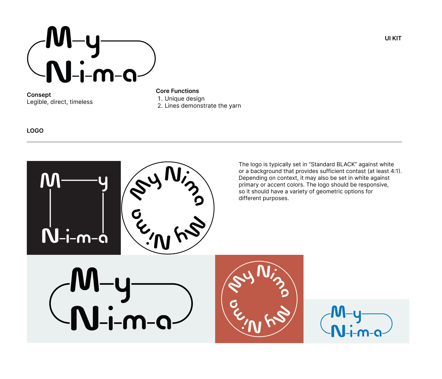
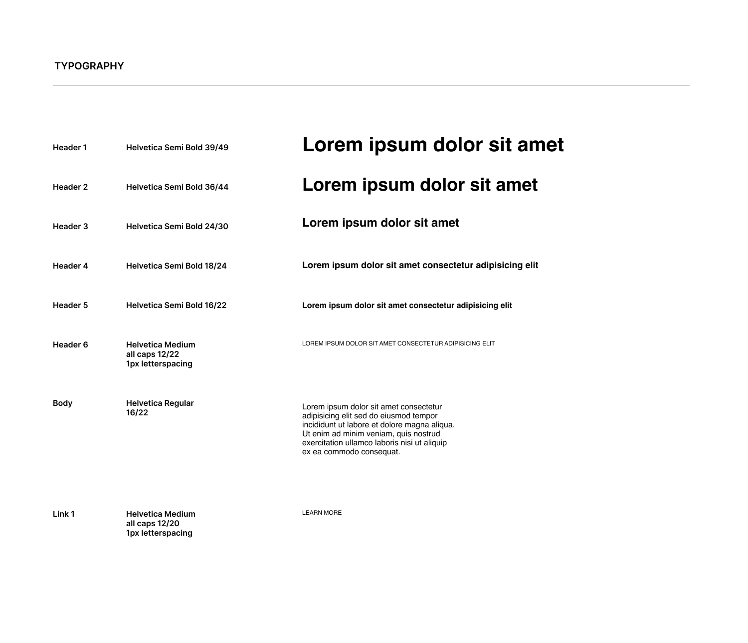
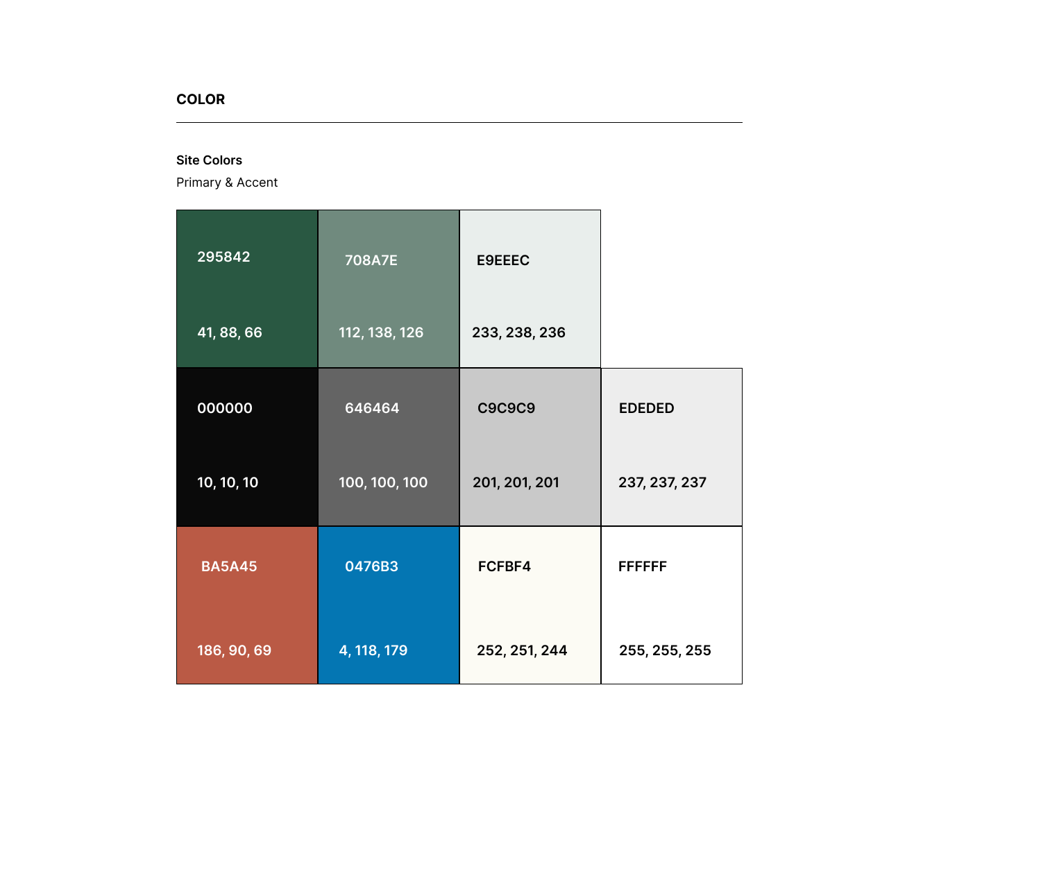
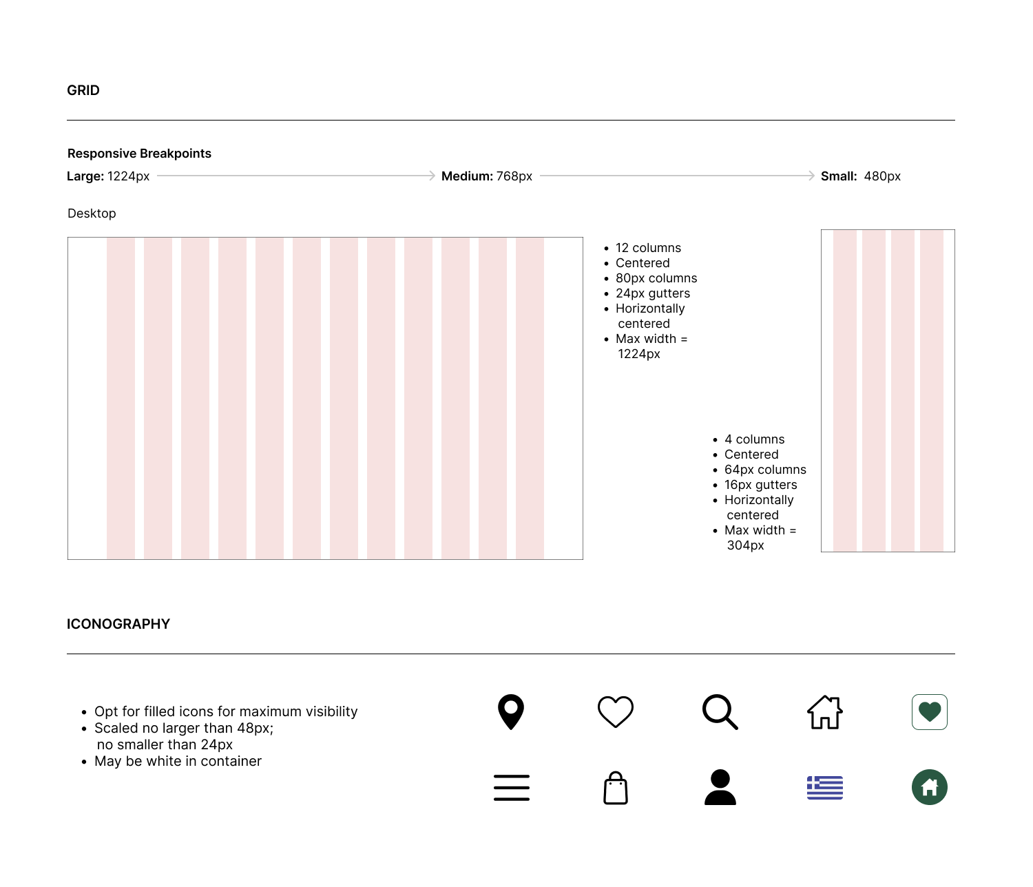
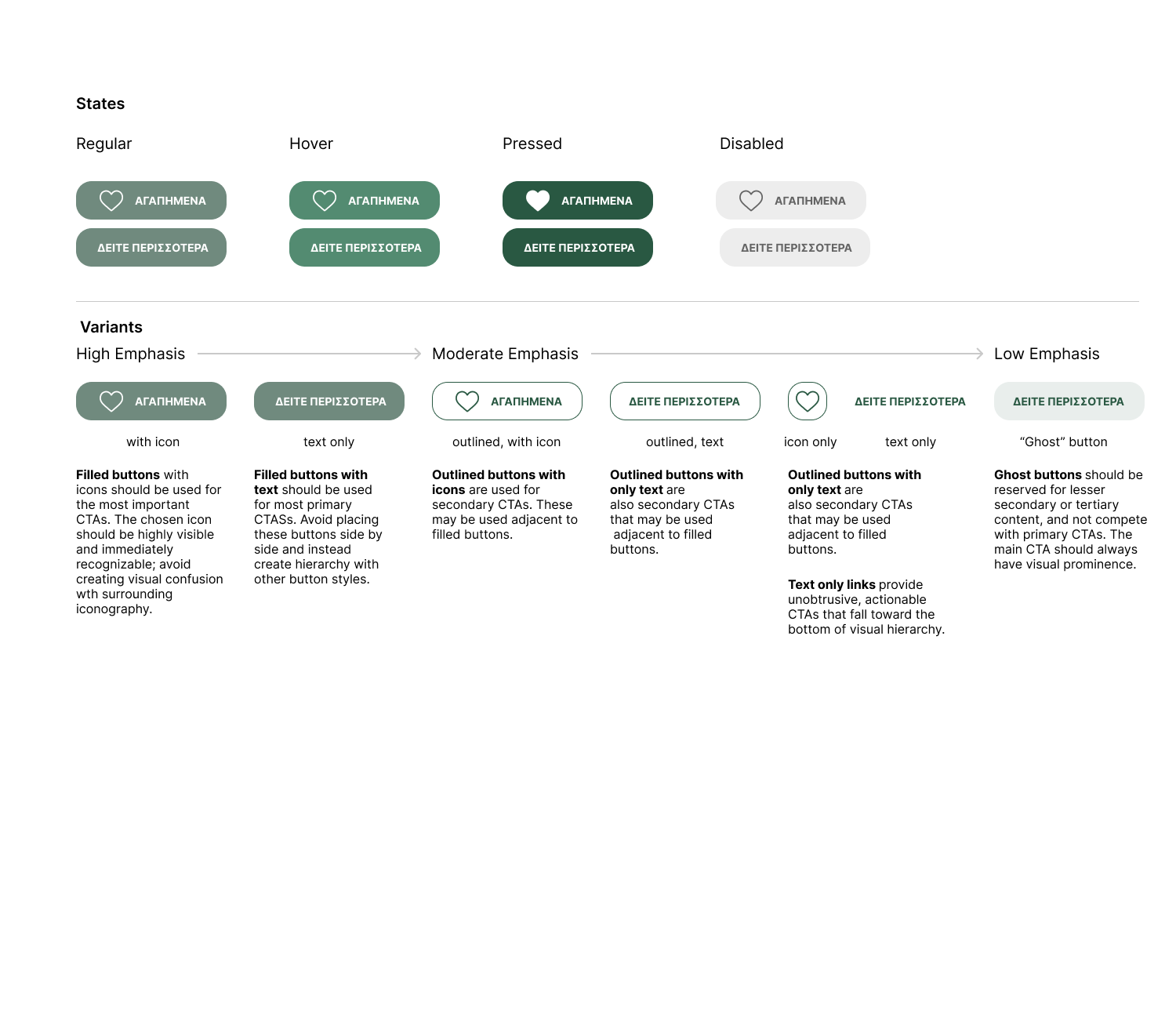
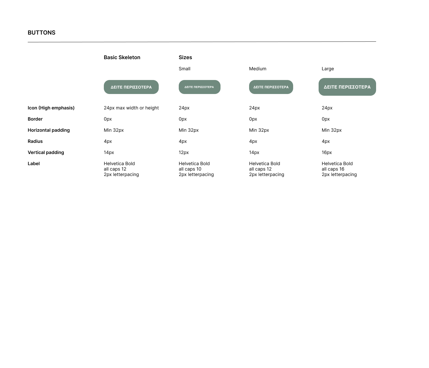
- UI kit
- Low-fidelity wireframes
- High-fidelity mockups & prototypes
- Usability tests and findings
Tools:
- Figma
- Photoshop
- Illustrator
- HTML
- CSS
User Research &
Define Problems
Competitive
Analysis
Define
new features
Design &
Prototype
Development
User Testing
Problems
Users find it challenging to navigate through the extensive product catalog, leading to frustration and a potential drop-off in engagement.
The current website lacks visual consistency, with disparate color schemes, typography and imagery, creating a disjointed user experience.
Users experience slow load times, negatively impacting the overall performance and user satisfaction of the platform.
Proposed Solutions
Implement a streamlined and intuitive navigation system with clear categories, filters, and a user-friendly search function. Conduct usability testing to validate the effectiveness of the new navigation structure.
Develop and adhere to a cohesive visual design system, defining a unified color palette, typography guidelines, and imagery styles. Ensure consistency across all pages and interactive elements to create a visually harmonious interface.
Optimize website performance by compressing images, leveraging browser caching and minimizing unnecessary scripts. Implement a content delivery network (CDN) to distribute content efficiently, resulting in faster load times and an improved user experience.
Research
I started my research with competitive analysis in order to understand the competitive landscape. I also wanted to identify functional and usability gaps by looking at alternative solutions. User surveys would help me understand what features and aspects of the product or service are most important to customers, so I could prioritize it. And lastly, one-on-one interviews could help me uncover users’ journeys in interacting with our platform and help me identify their pain points.
Findings
1. The competitive analysis showed that competing platforms are good at personalized recommendations, so there was a need for a similar feature in our product.
2. Alternative solutions highlight the lack of intuitive navigation in our current interface, indicating the need for a more streamlined and user-friendly design.
3. User surveys show that customers prioritize a seamless checkout process and real-time order tracking, emphasizing the importance of enhancing these features.
4. One-to-one interviews reveal that users often struggle to select the right products, suggesting an opportunity to simplify and improve the shopping experience.
5. Interviews revealed that users were frustrated by the sheer volume of products, indicating a need to organize categories.
Customers needed a well-organized shop to find what they needed and also to be able to understand how to use each product.
Developing Empathy with the hobbyists
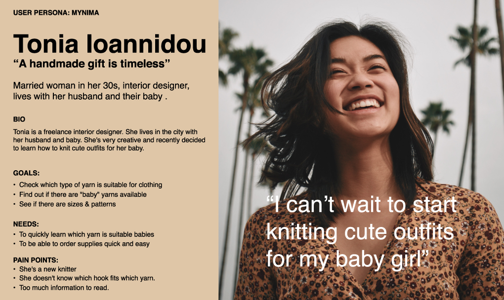
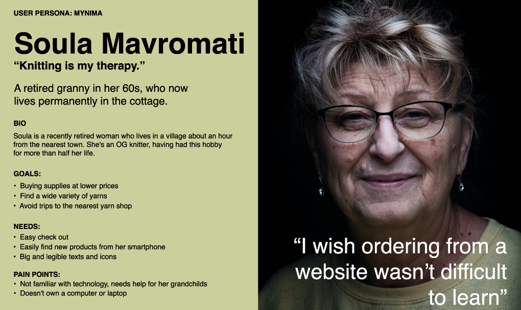
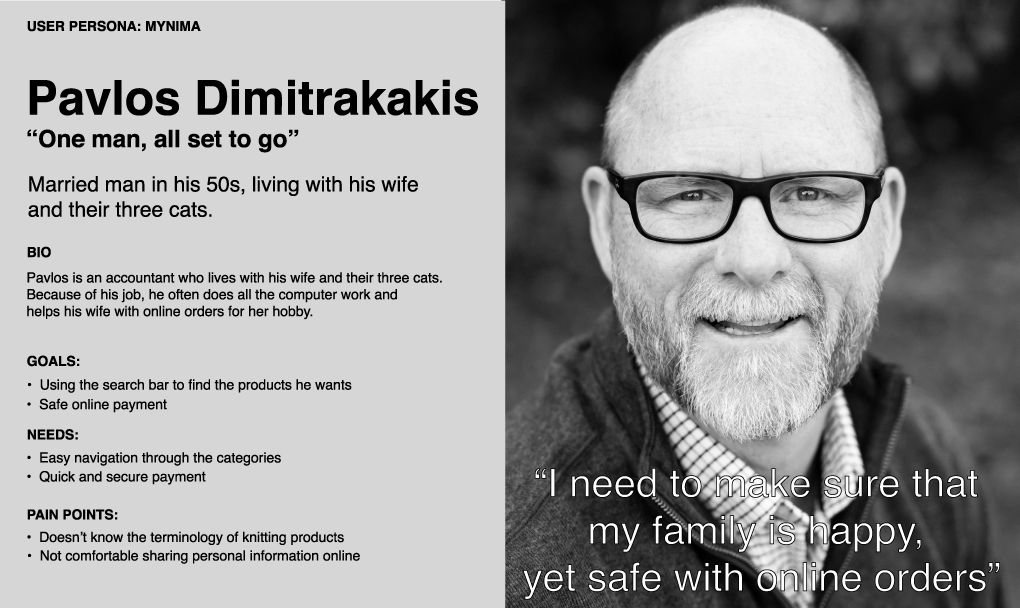
Given the project's niche audience, I conducted individual interviews to deeply connect with users, delving into their needs, challenges and preferences. Recognizing the significance of diverse representation, I synthesized the gathered insights into three personas to encompass a broad spectrum of user experiences. They would serve as important reference points for design decisions moving forward.
- They fear online payments
- Not necessarily have much technical experience
- May be new to hobby terminology
- They may be responsible for making online purchases for family members
Reorganize the Categories
To address the confusion stemming from the extensive array of products, I decided to streamline the categorization process by consolidating some existing categories and establishing broader umbrella categories. Subsequently, I chose to introduce variability to the products,aiming to reduce their quantity. This adjustment aims to provide users with a clearer and more comprehensible representation of the product offerings.
Information Architecture
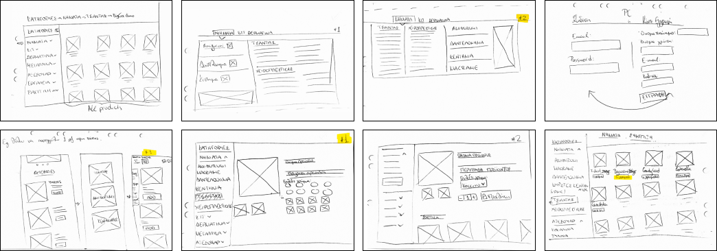
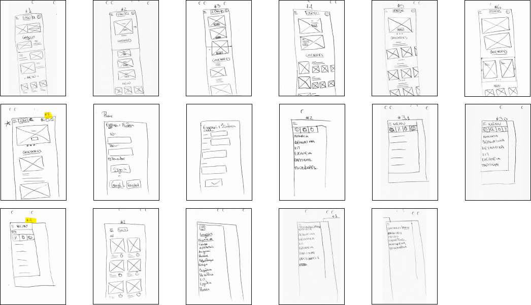
Identifying Design Patterns Through Rapid Sketching
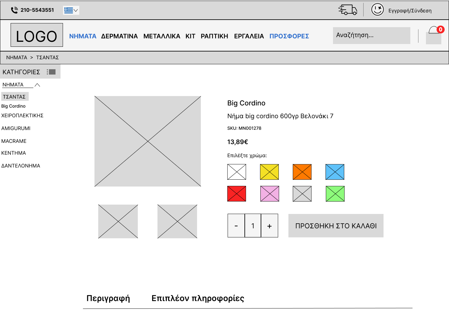
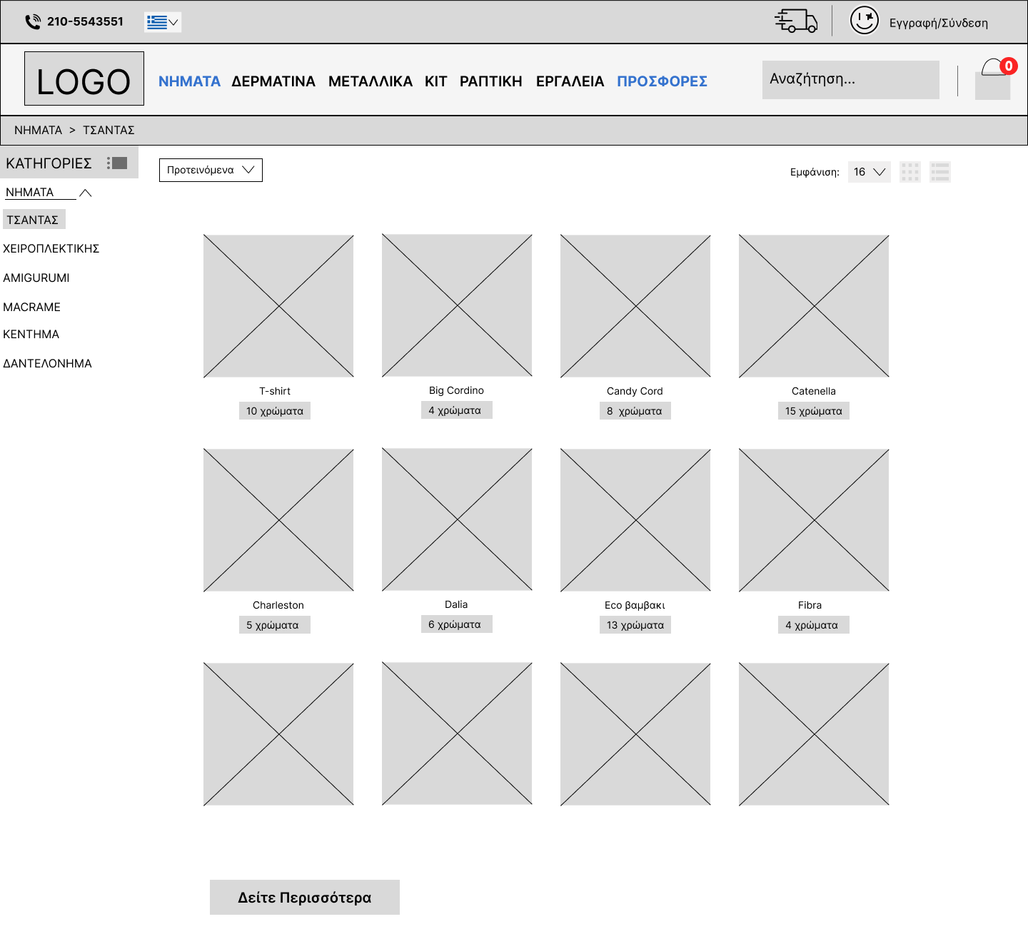
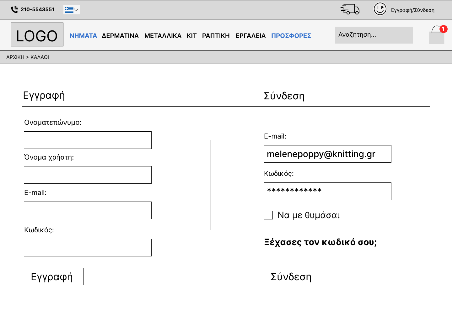
Through the process of sketching and delving into page organization, I discovered that the most effective approach involved well-defined modules with generous negative space, incorporating predictable design patterns tailored for seamless information browsing and an intuitive shopping journey. I then developed wireframes to engage with engineers and project specialists to gain their insight into the feasibility of this design. This also allowed me to determine whether the proposed design adequately addressed their challenges. In particular, I created designs with responsiveness in mind, ensuring an optimal user experience on both desktop and mobile platforms.

DESKTOP


PHONE

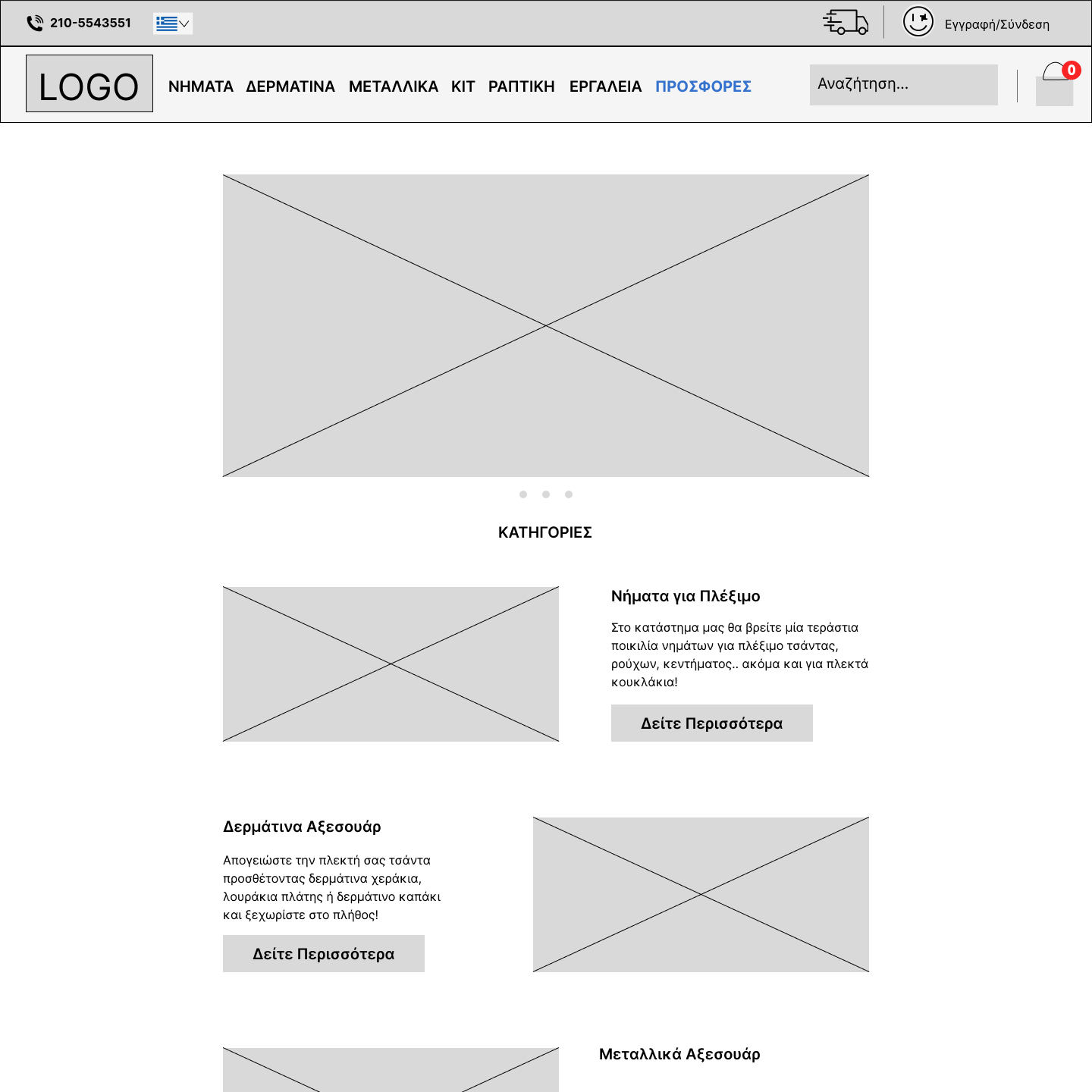
Wireframes
I also created wireframes to discuss with engineers and project specialists to see if this design is
feasible or not. By testing these wireframes I discovered problems users had with some of the
terminology, as well as functions they were expecting but were missing.
Launch
greyscale wireframes in PC mode
or in phone mode.
Clarifying Visual Design
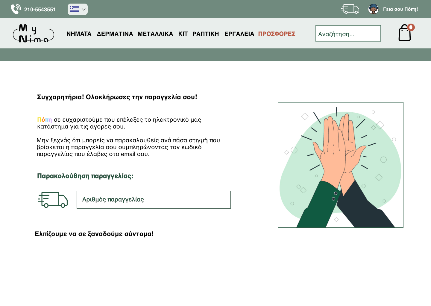
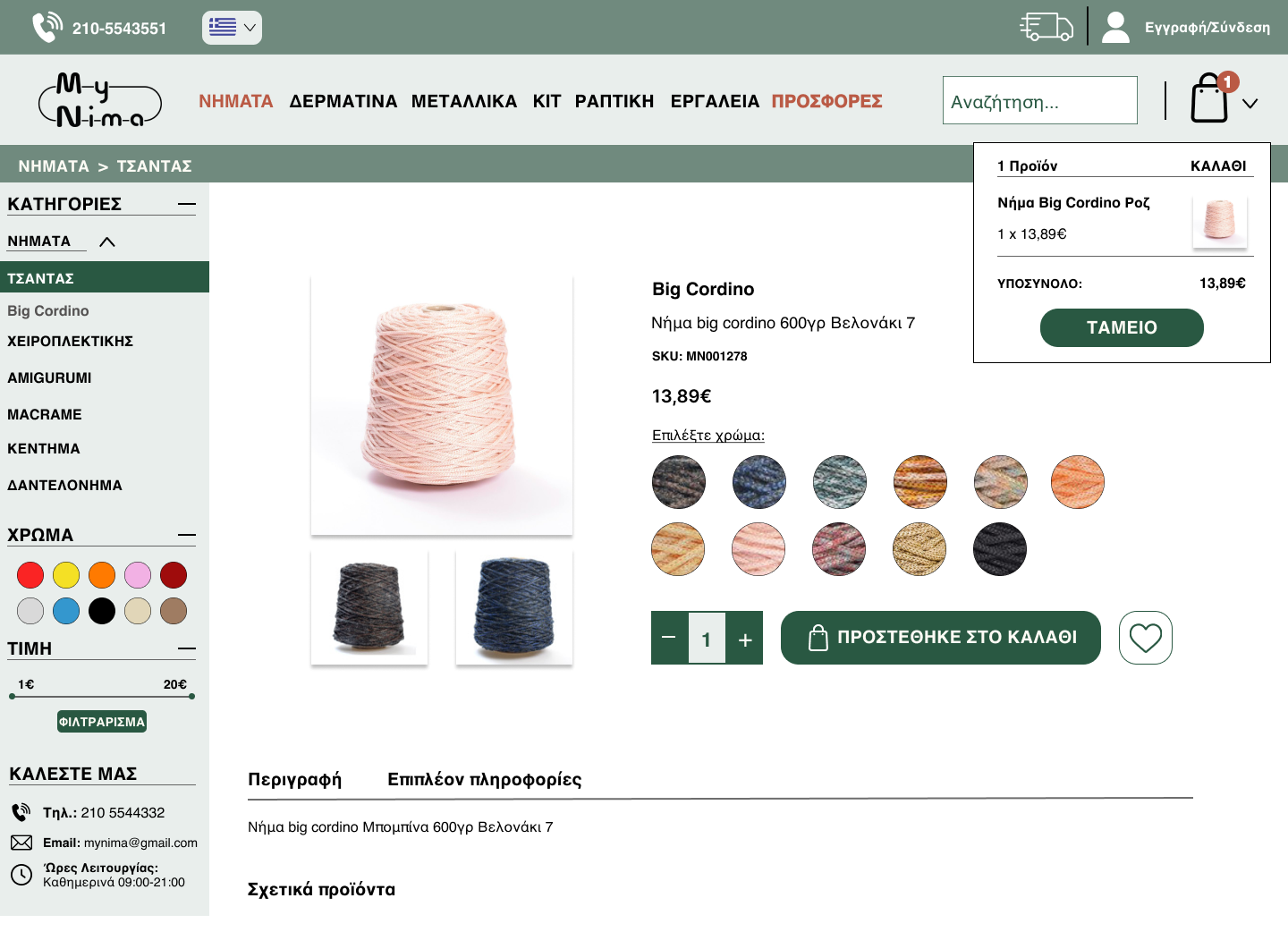
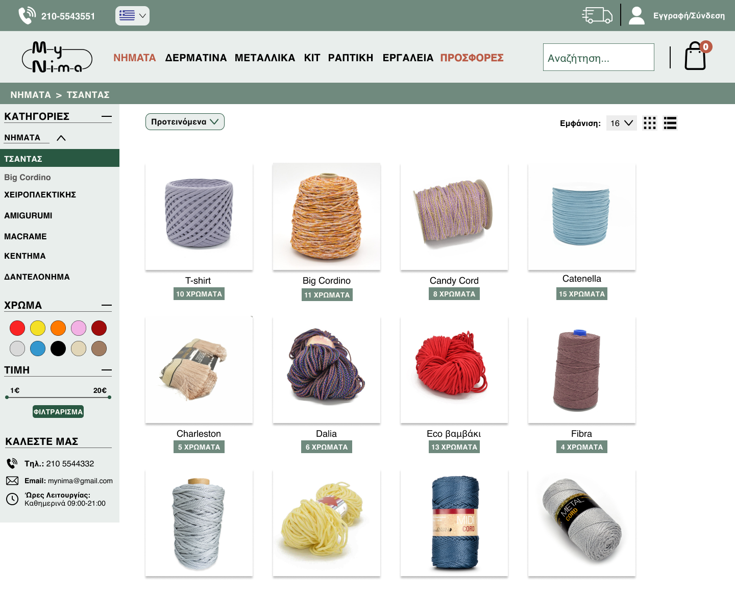
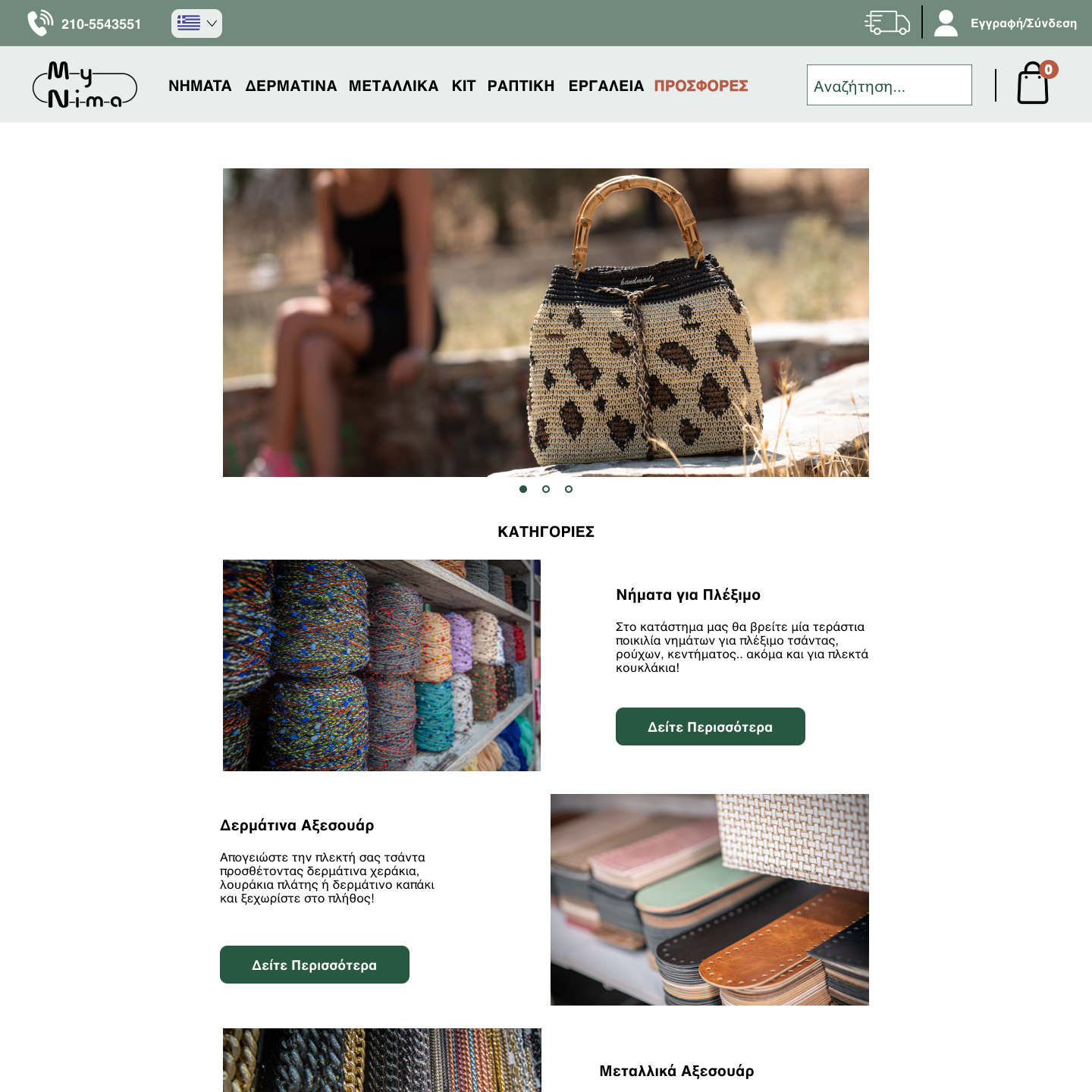
The new design aims to make it easier for customers to find and engage with products. I used a simple colour scheme to make the site more user-friendly. I focused on organising the visual content, making the product pages uncluttered and highlighting the call-to-action buttons to guide customers through the shopping experience.
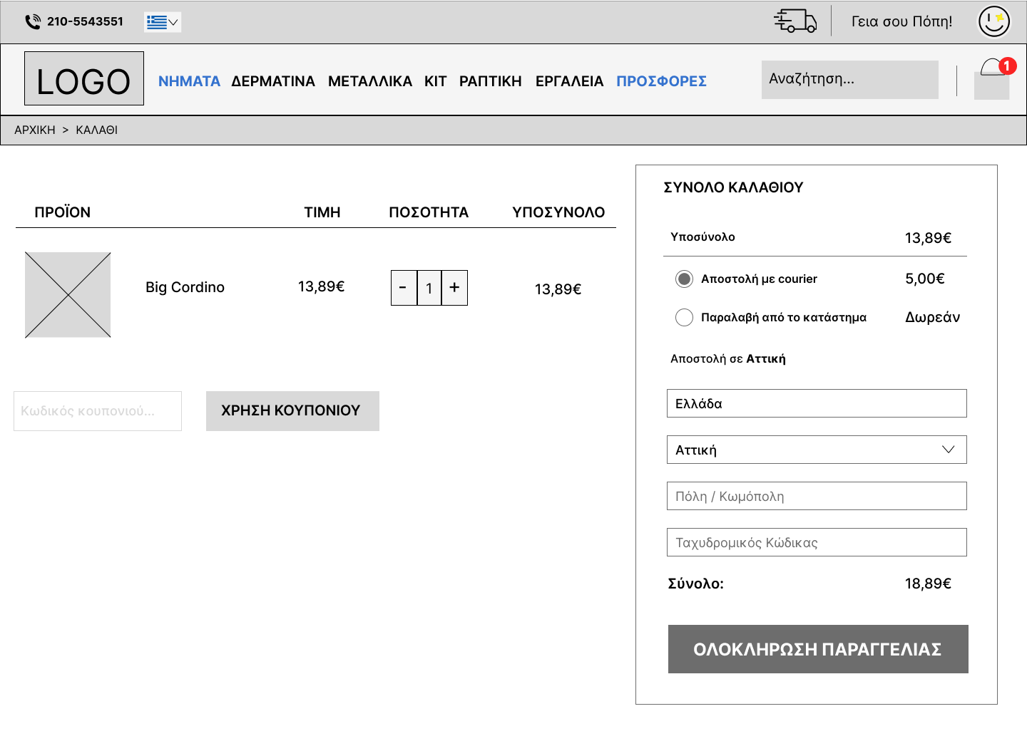
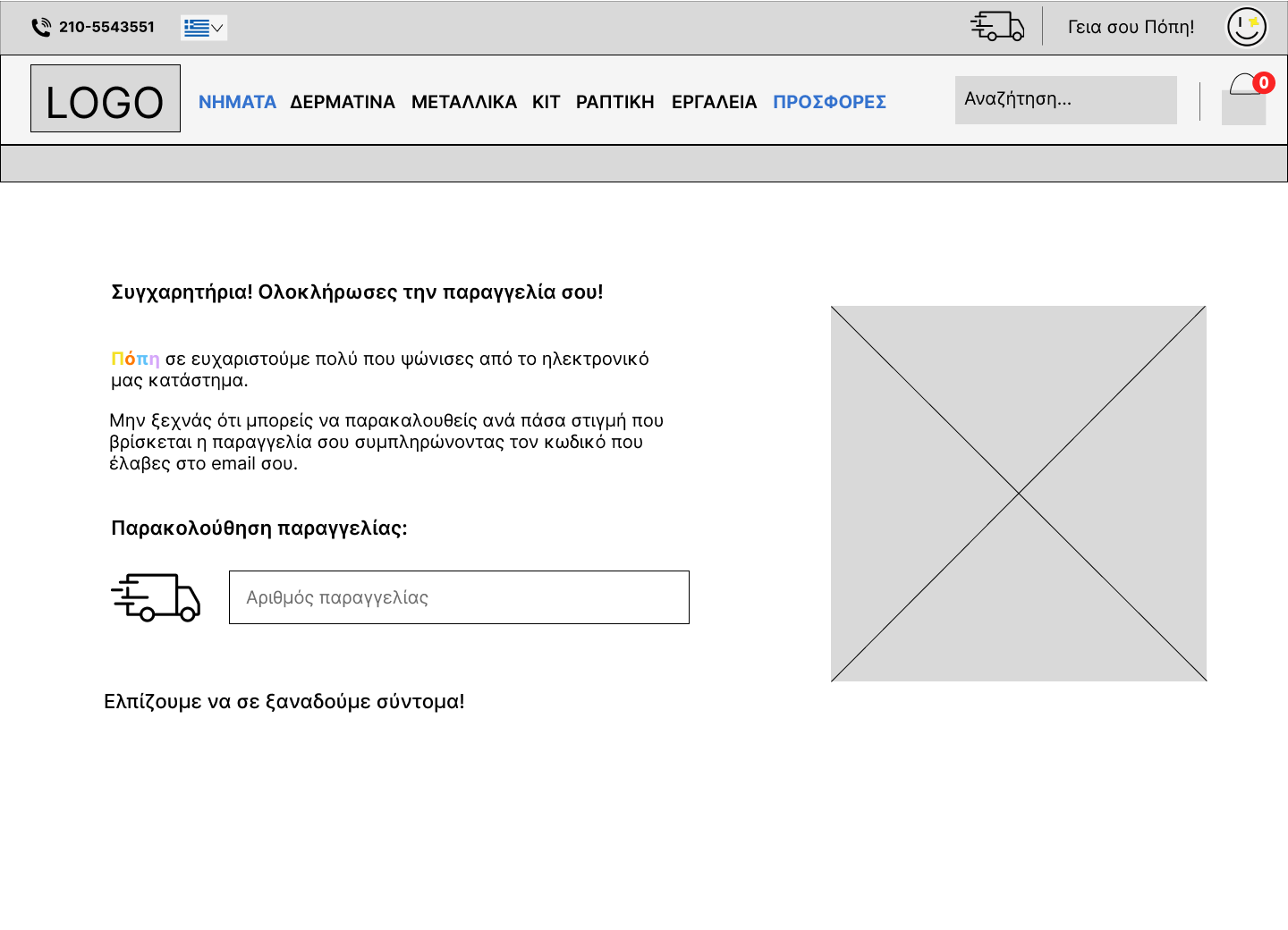
High Fidelity Prototype
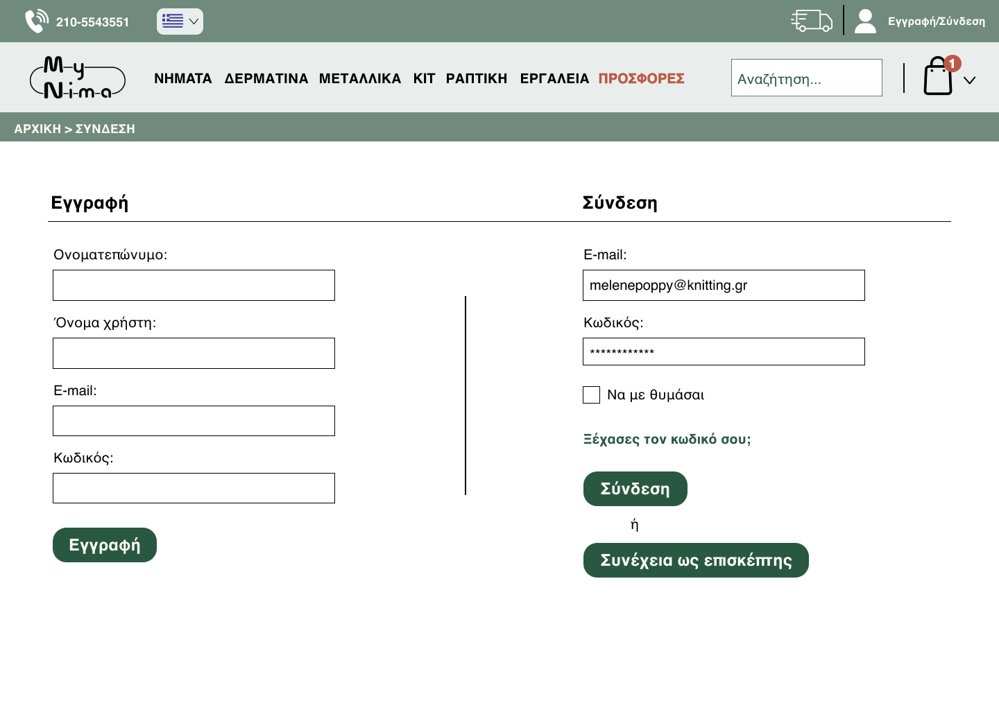
The hi-fi wireframes were detailed and interactive, showing the layout and functionality of each
component. They demonstrated the flow of user interactions and allowed for user testing and iterative
feedback, ensuring a smooth, intuitive experience before final development.
Launch
Prototype in PC mode
or in phone mode.
Usability Testing
I conducted a usability test with a group of five participants to evaluate the new product
browsing and checkout flow. The participants were tasked with finding a specific type of yarn
based on material and colour, adding it to the shopping basket and completing the checkout
process. The test measured time taken, number of clicks and any points of confusion or friction.
Results:
- Success Rate: 100% of participants successfully completed the task, showing that the redesigned product organization was intuitive.
- Time Efficiency: On average, users completed the task 25% faster compared to the previous design, indicating a smoother navigation experience.
- Users appreciated the clear categorization of products and the simplified filtering options. However, 2 out of 5 participants mentioned that the 'Add to Cart' button could be more prominent on mobile devices, leading to a minor adjustment in the final design.
Summary
In this project I successfully transformed the user experience of a yarn website by focusing on clarity, usability and engagement. By reorganising the product categories, creating a cohesive UI kit and clarifying the visual design, I made the site more accessible and visually appealing. High-fidelity wireframes and prototypes were essential in refining the user flow through usability testing and feedback. The results showed significant improvements in task completion times and user satisfaction, demonstrating the effectiveness of a user-centred design approach. This project highlights my ability to create intuitive, visually cohesive digital experiences that drive engagement and improve usability.
